Subscribe to blog updates via email »
Proportional Design Technique: My Biggest Design Secret, Revealed (Free Book!)
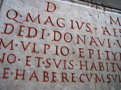 Today I am going to share with you my biggest design secret. Well, I think it’s a big secret, anyway – it may not turn out to be that unique at all. It all began when I spent a semester in Italy, studying the origins of typography. I discovered the meticulous geometry and beatiful proportions behind the letterforms of Bodoni, the within the margins of hand-scribed Bibles, and in the architecture all around Italy’s beautiful cities.
When I returned to The States, I was starving for more. My design program wasn’t concerned with these aspects of design, but my university’s library had any book I needed about typography and proportion. In addition to my regular class work, I regularly spent 16 hours a day, alone in my apartment, devouring all of these books. My curiousity with the relationship between proportion and beautiful typography became an obsession. I even conducted my own exercise, where I laid out copy from a deodorant stick onto a canvas using nothing but proportionally-derived space to create a hierarchy. A few years later, when I taught a typography class, it was this odd exercise that I adapted into a lesson plan that was published in Ilene Strizver’s Type Rules!.
After all of this experimentation, I, of course had to re-do every project in my portfolio to live up to my new standards. I developed a sort of technique, which I demonstrate in this video. No, I’m not using the golden ratio. I’m simply creating a series of “blocks,” of descending size, based upon the aspect ratio of the “canvas” itself. I then use those blocks to determine margins, the size of elements, and the size of spaces between those elements. Oh, just watch the damn video.
WANT TO WRITE A BOOK?
Download your FREE copy of How to Write a Book »
(for a limited time)
I talk about this technique a little in my Design for the Coder’s Mind presentation, but this video should give you a much clearer picture.
——–
Image via briangeek
Hey, FREE book!
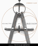 Best comment (relevant & thought-provoking) will receive a free copy of Kim Elam’s Geometry of Design, a book which I personally find fascinating. It’s full of illuminations of geometric proportion’s influence in beautiful design. Deadline: midnight PST Wednesday, February 18th.