Designing with White Space: Why 1+1=3
One of the most often overlooked factors of design – by beginning and even professional designers – is that of the delicate use of white space. By really considering the way that white space works, you can communicate more elegantly, and create design that has a more “clean” look. By really considering the way white space works, you’ll be less likely to use extraneous ornamentation such as rule lines, and you’ll be less likely to change fonts and colors just to differentiate pieces of information in your design.
The most powerful concept in really understanding the way white space works is that of 1+1=3. My introduction to this concept was in the book “Envisioning Information”, by information design guru Edward Tufte. If you like what follows, go read his books.
White Space is Something
When we think of white space – or negative space – many of us think of nothing. But to understand that 1+1=3, you have to understand that white space is, in fact, something.
If I put the words “dogs” and “furry” right next to each other, you can hardly distinguish the words, but for your knowledge of the English language. You probably have yet to be introduced to the word “dogsfurry.”

But, just by separating those two words by a piece of white space, they are now perceived as separate pieces of information.

But, since they are still relatively close to each other, and lined up with one another, we see them as belonging together in some way. This phenomenon is described by Gestalt theory, which posits that we view things as more than the sum of their parts.
If we divide up this white space with a simple rule line, we now have not one, not two, but three design elements separating our information: the rule line, and the two pieces of white space that flank it.

Most tabular data is laid out this way by default. Supposedly these rule lines help guide our eye the navigate the table and see which column and row with which each data point is associated. So, you often see tables that are designed like so:
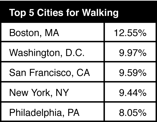
These rule lines hold no information. This table may seem fine at first glance, until you learn that you could have an equally (or more, as I’d argue) effective table with no rule lines at all:
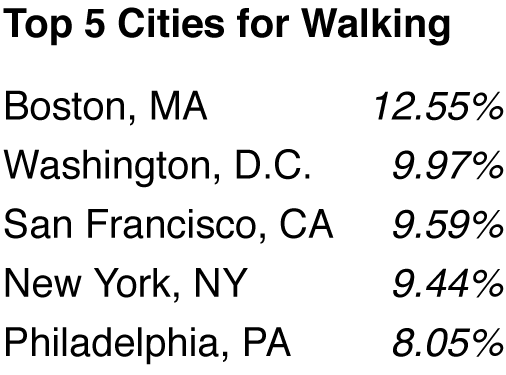
Our brains connect these pieces of information without the aid of rule lines. Because these things are lined up, we can make the proper associations. Note, also, that I have italicized the values to further differentiate them.
Of course, not every table is this simple. With exceptionally wide tables, it can be truly difficult to keep track of which row of data you are scanning. This is where alternating dark and light backgrounds can come in handy.
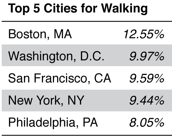
This has the added benefit of making the table a little more visually interesting, which – alone – is not a good reason to do this.
Notice that the shaded backgrounds do not have rule lines to signal where they begin and end. The end of the shaded background alone is enough to signal this. Also notice what a beautifully crisp appearance the left and right side of the table has: because the shaded rows line up, we perceive this as a crisp edge.
Taking it Further
Understanding white space in this way won’t only make your tables cleaner. This table is just a small petri dish within which you can see at a very detailed level how white space, information, and our perception all interact.

This little error message looks laughably bad. Here are some of the problems it has:
- Too many factors are being used: font, a colored background, a rule line. The (imaginary) designer wasn’t sure why it didn’t look right because he didn’t know how to manage white space.
- There’s no rational relationship between the amount of white space between the elements, and the sizes of the elements themselves.
- There’s no rational relationship between the sizes of the various elements, so it’s communicating unclearly. What is more visually important, the icon, or the main “hey you!” message?

This one looks much nicer. Here’s a few reasons why:
- There are few factors being used. The white space is managed well, so the designer can get away with this.
- There is a rational relationship between the amount of white space between the elements, and the sizes of the elements themselves. For example, the white space between the “hey you!” heading and the smaller message is about the same height as the smaller message itself.
- There is a rational relationship between the sizes of the various elements. For example, the icon is about the same height as the main “hey you!” message. The icon is clearly the dominant element, and anchors the eye.
Next time you’re designing something, before you throw in a rule line, or a shaded background, or even a font change, think about the white space first. Doing so can make a big difference in what you communicate, and make your designs look cleaner.
——
Especially if you’re a beginning designer, this stuff is more important than anything else. It’s so important, that I’ve developed an entire course on white space. But, it’s only available to people who have been through my free 12-week email course (you can sign up here).
Designing with White Space: Why 1+1=3 http://t.co/yCEhltgPMv
— 📗 David Kadavy (@kadavy) September 6, 2015
This post originally appeared on the author’s blog.

5 Essential Type Tips
What you must know to design like a pro.
You’ll also get bonus articles, discounts, podcast updates, & enrollment in our free design course.
We have a strict Privacy Policy.