Why You Don’t Use Garamond on The Web
Amongst designers – especially print designers – Garamond is considered one of the best fonts in existence. It’s timeless, and very readable. But, because of the limitations of current display technologies, it’s not a good font to use in web copy – even with the advent of font embedding methodologies such as TypeKit and Google Font API.
One of the most important principles behind every good piece of design is that the designer has to master his or her medium. With any medium – whether it’s pencil and paper, steel and glass, or pixels – the designer has to work with strengths and limitations. Work with these characteristics, and the design stands a chance to be good – work against them, and there is no chance.
Apple’s lead designer, Jonathan Ive knows this. He recently said
The best design explicitly acknowledges that you cannot disconnect the form from the material – the material informs the form…
Medium and Form in Type History
Typography is the perfect vehicle with which to illustrate this concept throughout history. From the beginning, the forms of our letters have been influenced by the tools we used to create them.
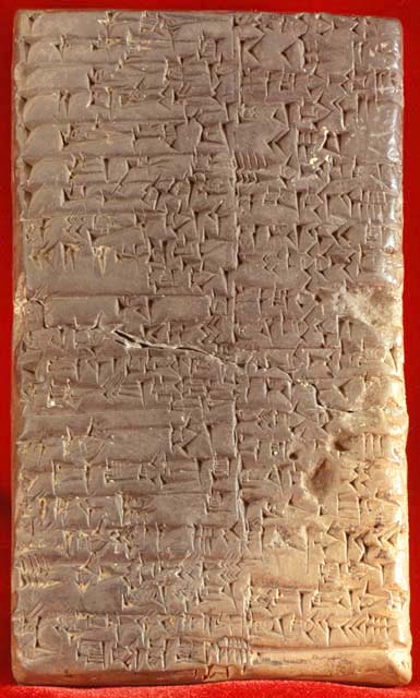
This cuneiform inscribed tablet is an early example of how medium influenced form in written communication. You can see, looking at these pictograms, that they are made up of a series of indentions that are pretty much identical. This is because they were formed using a wedge-shaped stylus.
As this language was replaced in the west by our current roman characters, and the tools which we used changed, so did the form of our letters. Some of the best examples of early typography using roman characters are from – you guessed it – the Roman empire.
This is graffiti from the ancient city of Pompeii. It was created using a brush, and this is apparent in the letterforms. You can see there’s a great deal of variation in the strokes that make up the letters, and they all terminate with a soft point, just like you would expect from a brush.
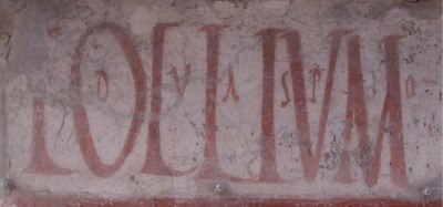
This graffiti was clearly created with a brush.
Photo byvirtusincertus
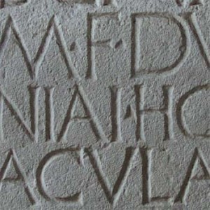
Here’s a picture I took from Pompeii that I blogged about several years ago – dating back to the same time (remember, this city was frozen in time when it was buried under volcanic ash in 79AD). Only this time, the sign was chiseled in stone – and you can see how this has influenced the letters: all of the strokes of the letters are uniform in width, and to make the ends of those strokes looks nice – serifs were added. You can see little spur serifs from where the chisel was applied perpendicular to the stroke of each of these letters.
Now, moving more quickly through history, we have letters from the column of Trajan (which inspired today’s Trajan font), which were formed first by brush, then by chisel (it would have been awkward to chisel letters like the brush-drawn ones in the earlier Pompeii example). Then we moved on to lead and wood-cut printing, which first imitated work done by scribes with pens.
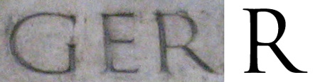
The lettering on the column of Trajan were brushed on, then chiseled.
Photo by Silver Tusk
Once actual drawing tools were a smaller part of the design equation, typographers started to get more theoretical with their designs – creating constraints of their own – fonts like Bodoni are geometrically rationalized, as they were created in a medium (cast metal) with relatively few restrictions.
Does A Little Too Much Freedom = A Little Too Much Garamond?
In modern web typography, we still have the restriction that the letters of our alphabet take certain forms, but many restrictions have been removed. Rather than only having a couple of fonts available in our typecases, there are thousands. So, this makes it easy for bad habits to develop, such as trapping our information in images, or using fonts that just aren’t good for the web.
So, what makes a font bad for the web? There’s the widely-known issue of availability of fonts on the computers of our audience members – this, of course, is why we’re usually using widely-available fonts like Arial, Verdana, Georgia, Times New Roman etc.. Now there are some pretty feasible ways of using whatever fonts we want – methods like SIFR, Typekit, and Google’s new Font API, but that still doesn’t mean you should use just any font. Even great classics like Garamond can be a disaster on the web, so its better to use a modern font that has been drawn with the screen in mind.
![]()
And the reason behind this is that our display technology isn’t up to par with paper. You can see here a comparison of the great classic font, Garamond, blown up (as it might look on paper), next to a detail of what it would be anti-aliased at 12px height on a modern computer screen. You can see that it doesn’t look so good on-screen, because it’s just made up of a bunch of blocks of color.
Why Garamond Doesn’t Work With the Screen
So, the popular web fonts (Arial, Verdana, Georgia, and Times New Roman) are such not only because of their wide availability, but because they are drawn with the screen’s limitations in mind.
This Flash animation that I created illustrates how pixels distort curvilinear form – such as that of typography. It’s the same series of concentric rings, but as it changes sizes, you can see that a moiré effect results from trying to draw these rings out of mere pixels. So, the most web-appropriate fonts are drawn with these limitations in mind.
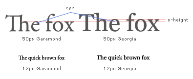
This illustration shows just what I mean by that. Georgia reads better on screen than Garamond primarily because it has a higher x-height (the height of an “x”), and – as a result – a larger eye. This prevents letters such as “e” from becoming muddled and unreadable, and overall makes the letters actually look larger. The notes on this illustration are in 9px Verdana with no anti-aliasing; and you can see those letters read very crisply, as this font was made for such an application.
Georgia has a huge advantage over Garamond on-screen because it was designed to be displayed as such from the very beginning, when it was designed by Matthew Carter for Microsoft in the mid-90’s. This has manifest itself in sharp serifs on Georgia, rather than more subtly modeled ones on Garamond. Look at little curve on the bottom of Garamond. This gets blurred at smaller sizes, and hurts the legibility of Garamond.
This limitation of screen technology has been embraced, and taken to extremes, though.
Starting in the late 90’s and early 00’s, we saw lots of pixel fonts being used in Flash, such as these from Craig Kroeger’s miniml.com, which are designed to be used at specific sizes, with no anti-aliasing.
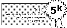
When it was more common for computers to have only 256 colors, which caused dithering, designers embraced that constraint to inform their designs. Though ostensibly created to minimize bandwidth (another constraint of medium), designs that were created for the5k embraced dithering and lucidly used every pixel.
The “Web 2.0” design trends of the last five years or so, are thanks to display quality and bandwidth improving, removing some of this constraint. In 2000, 12% of web users had only 256 colors on their monitors – in 2010, 97% have over 16 million colors (the number of colors available has a big impact on how crisply type, images, or *gradients* are displayed). This has put into the hands of designers a color palette beyond that of CMYK printing, with increased bandwidth to push it through.
Additionally, displays are cramming in more pixels per inch (ppi). The cheap Dell monitor I’m typing this on is displaying at 100ppi, and my MacBook Pro is displaying at about 115ppi. Compare that to the iPhone 4, which displays at an impressive 326ppi. Now, we’re starting to get some display technologies that are approaching the quality of paper when it comes to displaying letterforms readably.
So, maybe some day Garamond can make its comeback.
Want to learn more about picking fonts? Take my free design course.

5 Essential Type Tips
What you must know to design like a pro.
You’ll also get bonus articles, discounts, podcast updates, & enrollment in our free design course.
We have a strict Privacy Policy.